


Land Temperature Bell Curve
Sources:Colorado State University and NASA
Many aspects of climate graph into bell curves, thick (or high), in the center,where most numbers will fall, and increasingly thin (or low) on both sides, where higher and lower numbers will fall. For instance, if for many years we measure a regions's high summer temperatures and then graph those numbers, we will find that most years will fall somewhere in the bell's thick center, where they are close to the average (or mean), the highest point on the bell. Summers that are warmer and cooler than average will appear along the sloping sides. The very hottest and coldest summers will fall along the bell's skinny tails.
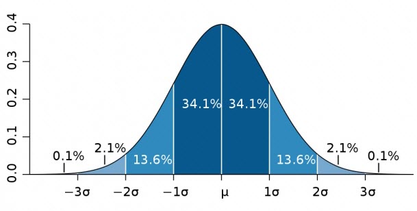
The width of the bell (which indicates variability) is measured in units called standard deviations. By definition:
- Things that happen about 2/3 of the time (68%) fall into the middle zone, within one standard deviation from the center (the norm or average): we could call this "normal".
- Things that happen from 4% to 27% of the time fall between 1 and 2 standard deviations from the norm: we could call this "unusual". Just 1 in every 20 events will fall outside these two zones.
- Things that happen from 0.2% of the time, 3 standard deviations from the norm, would be called "extreme".
- Only 3 events of every 1,000 fall outside of 3 standard deviations: these events are practically unheard-of.
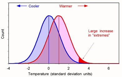
Even a small shift of the bell to the left or right can produce huge changes in the likelihood of these "extreme" events.This sketch illustrates what happens when a bell curve of temperatures shifts to the right. Note how the coldest temperatures nearly vanish and the hottest become much more likely. And note how a whole new zone of extremely hot temperatures grows on the bell curve's right-hand tail.
Below is an animation showing the shift in the bell curve. This visualization shows that as land temperatures have increased since 1950, hotter days have become more common and colder days have become less common. When the bell curve becomes shorter, one can see more data trending toward the right, revealing hotter days.
This visualization shows how the distribution of land temperature anomalies has varied over time. As the planet has warmed, we see the peak of the distribution shifting to the right. The distribution of temperatures broadens as well. This broadening is most likely due to differential regional warming rather than increased temperature variability at any given location.
These distributions are calculated from the Goddard Institute of Space Studies GISTEMP surface temperature analysis. Distributions are determined for each year using a kernal density estimator, and morph between those distributions in the animation.